

Hello,
Today I am going to introduce you to Next js with the help of a project. Next js is an open-source development framework built on top of Node.js enabling React based web applications functionalities such as server-side rendering and generating static websites. I have made extensive use of service provided by next js in creating this project. I will try to keep the explanation concise . Checkout the references mentioned throughout the bog for more details on next js and other react libraries used in this project. This web app is a character wiki page for the famous web series 'Rick and Morty.
Links
Live Demo: https://rickandmorty-info.vercel.app/
Github Repo: https://github.com/shrey27/rick_and_morty_wiki
Project Overview
The topics we'll cover while building this project are:
- Pre-rendering using Next JS, using getStaticProps
- React Hooks (useState, useEffect)
- Functional Component based programming
- Redux-Thunk with Next JS for async API calls
- Rebass - for styling
- Pagination
- Search bar with debouncing
- Data Filtering using React-bootstrap Accordian library
- Dynamic routing using file based routing in Next JS
- Dropdown menu using React-Select
To begin with first take a look at the file structure:
- Components
- Cards
- Filter
- Navbar
- Pagination
- Search
- Pages
- _app.js
- index.js
- [charactedId].js
- episode
- location
- Redux
- actionCreator.js
- actions.js
- reducer.js
- store.js
- styles
- common.module.css
- globals.css
Development
Before we begin the development run the following commands to start the development in VS code-
npx create-next-app rickandmortywiki
npm install rebass
Resource links:
Next JS: https://nextjs.org/docs/getting-started
Rebass: https://rebassjs.org/
Components
Navbar
Instead of using Link tag from Next js I will use an external library ActiveLink. We will use ActiveLink tag for styling the nav-links of current page. Check the below code snippet for more details.
<ActiveLink activeClassName='active' href='/'>
    <a className='nav-link'>Characters</a>
 </ActiveLink>
 <ActiveLink activeClassName='active' href='/episode'>
    <a className='nav-link'>Episodes</a>
 </ActiveLink>
 <ActiveLink activeClassName='active' href='/location'>
   <a className='nav-link'>Locations</a>
 </ActiveLink>
Check out this link on how to use Active link and style the nav link for current page: https://stackblitz.com/github/vercel/next.js/tree/canary/examples/active-class-name?file=components%2FActiveLink.js
To add additional styling to link tags I have made use of style jsx tags provided by Next js.
<style jsx>{`
        .nav-link {
          text-decoration: none;
          padding: 0rem 1rem 0.5rem;
          font-size: 1.25rem;
          color: rgba(0, 0, 0, 0.55);
          transition: all 300ms;
        }
        @media screen and (max-width: 768px) {
          .nav-link {
            font-size: 1rem;
          }
        }
        .active.nav-link:hover {
          color: #0b5ed7;
        }

      `}</style>
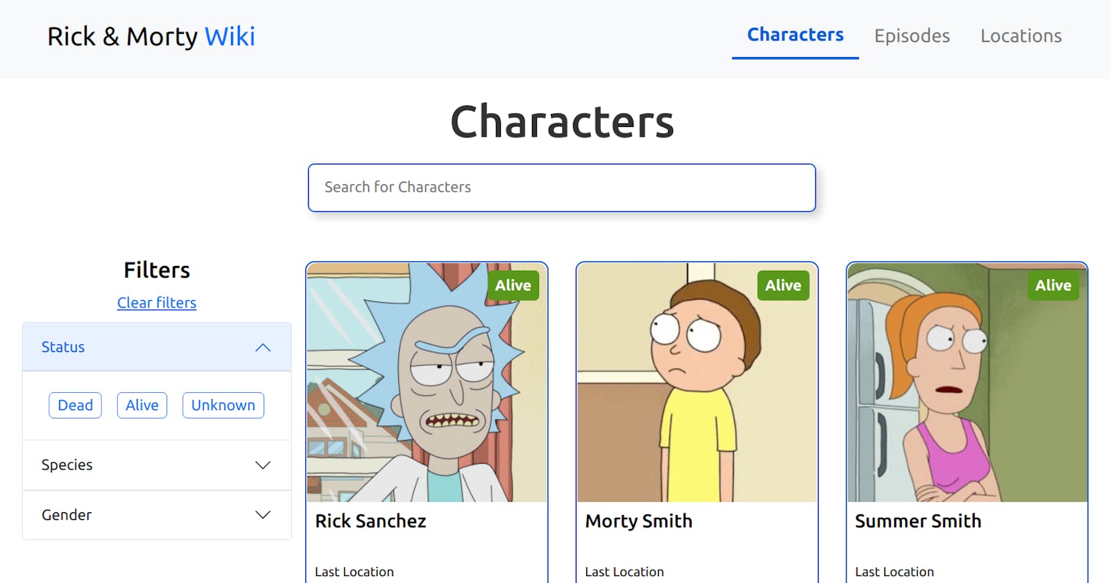
This is how our Navbar looks like.

Search Bar
Search bar is made using predefined styled components of rebass i.e. Input and Heading. Apart from this I have added the following debouncing code in search bar.
const setSearch = (e) => {
    setSearchTerm(e.target.value);
  };

const debounce = (func, time) => {
    let timer;
    return () => {
      clearTimeout(timer);
      timer = setTimeout(func, time);
    };
  };

<Input onKeyUp={(e) => debounce(setSearch(e), 500)} />
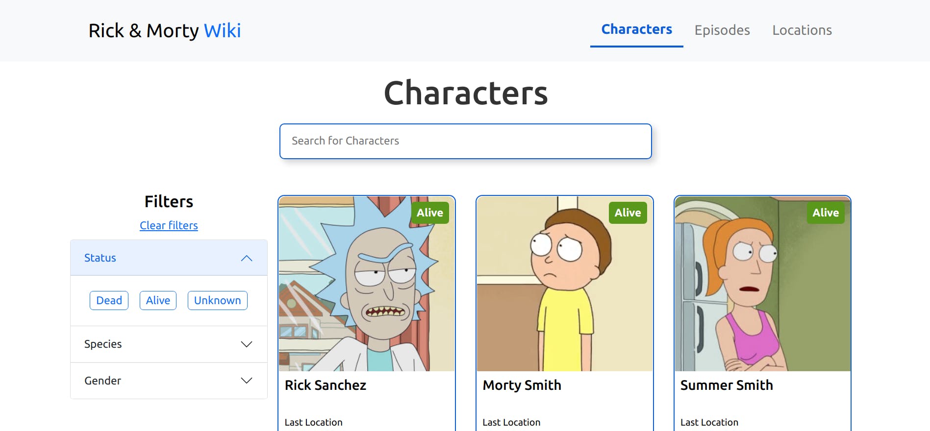
After styling search bar component will look like this.

Accordian Filter
Filter menu is created using Accordian library from React-bootstrap. Use this command to install it.
npm install react-bootstrap bootstrap@5.1.3
To read more about how to style the accordian menu check the official docs using this link, https://react-bootstrap.github.io/components/accordion/
There is a separate file name category.js for storing filter info related to Accordian menu. Go through that as I have used map function inside Accordian menu to render filter options.
<Accordion.Item eventKey='Status'>
          <Accordion.Header>Status</Accordion.Header>
          <Accordion.Body>
            <Flex flexWrap={'wrap'}>
              {category[0].options.map((op) => {
                return (
                  <FilterOption
                    key={op + category[0].id}
                    optionName={op}
                    name={category[0].name}
                    setFunction={setStatus}
                    updatePageNumber={updatePageNumber}
                  />
                );
              })}
            </Flex>
          </Accordion.Body>
        </Accordion.Item>
Also to style filter options I have used common module css to write custom css code. Go through the FilterOption component for styling and functionality related info. Point to observe here is that all the filter options are technically radio input options for a single category. E.g. for Status category, filteroptions are 'Dead', 'Alive' and 'Unknown'. Value, name and id for every filter option is passed via props to the filter option component. Here is the code snippet for FilterOption component.
import styles from '../../styles/common.module.css';
<div className={styles.filterBox}>
      <input
        type='radio'
        name={name}
        className={styles.filterInput}
        value={optionName}
        id={optionName}
        onClick={handleClick}
      />
      <span className={styles.filterName}>{optionName}</span>
</div>

Clear filter button simply clears the selected input fields and force reloads the page to clear all the styling written via common.module.css.
const clearAll = () => {
    setSpecies('');
    setStatus('');
    setGender('');
    updatePageNumber(1);
    window.location.reload(false);
  }
<Button
        fontFamily={'ubuntu'}
        width={'100%'}
        onClick={clearAll}
        sx={{
          color: '#0d6efd',
          textDecoration: 'underline',
          backgroundColor: 'white',
          textAlign: 'center',
        }}
      >
        Clear filters
</Button>
Dropdown Menu
Dropdown menu is available for Episode and Location pages only. The purpose of the menu is to choose an option from the menu and the related episode details will be rendered parallel to the menu. Even though the options for both the pages are completely different the core functionality is same. The Dropdown component is designed in a way to accommodate functionality for both the Episode and Location pages. I have used React-select component to implement and style the dropdown menu. Install it using th following command.
npm i react-select
List of options for the drop down menu and the function to execute on selection of an option are provided via props to the Dropdown component.
const Dropdown = ({ name, setFunction, count }) => {
  let [selectedOption, setSelectedOption] = useState(null);

  const options = [...Array(count).keys()].map((x, index) => {
    return { value: `${x + 1}`, label: `${name} - ${x + 1}` };
  });

  const handleChange = (e) => {
    setSelectedOption(e.lable);
    setFunction(e.value);
  };
  return (
    <Box>
      <Select
        placeholder='Choose Episode'
        value={selectedOption}
        onChange={handleChange}
        options={options}
      />
    </Box>
  );
};

Pagination
The most trickiest logic to implement in the entire project was for the react pagination component. We will use React-paginate library to implement this component and I will try to briefly explain the props used and their use case.
Install the react-paginate library using the following command.
npm i react-paginate
We haven't reached the API section, but I want to highlight a small fact before I explain pagination. When we hit the fetch call to an API we have to mention page number as well because the API sends the data in pages. If not, we will always get the details from first page. So when we select a page using pagination component, we have to set the page number and hit the api so as to update the data with details from that particular page only. This is the case with home page only. You will learn about the distinction in detail in API section.
export default function PaginationBar({info, pageNumber, updatePageNumber}){
  let handlePageChange = (data) => {
    updatePageNumber(data.selected + 1);
  };

  return (
    <>
      <ReactPaginate
        className={styles.pagination}
        nextLabel='Next'
        forcePage={pageNumber === 1 ? 0 : pageNumber - 1}
        previousLabel='Prev'
        previousClassName={info?.pages ? styles.prev : styles.dispNone}
        nextClassName={info?.pages ? styles.next : styles.dispNone}
        activeClassName={styles.active}
        activeLinkClassName={styles.activeLink}
        marginPagesDisplayed={isMobile ? 1 : 2}
        pageRangeDisplayed={isMobile ? 2 : 3}
        pageCount={info ? info?.pages : 0}
        onPageChange={handlePageChange}
        pageClassName={styles.pageItem}
        pageLinkClassName={styles.pageLink}
      />
    </>
  );
};
Props used in Reactpaginate component.
- className, for styling the parent container of pagination
- forcePage, to forcefully shift page programmatically
- previousLabel and nextLabel, name of previous and next button respectively
- previousClassName and nextClassName, names of styling classes for previous and next buttons
- activeClassName, to style the li tag of current page component
- activelinkClassName, to style the a tag inside li tag of current page component
- marginPagesDisplayed, number of page component visible on start and end of pagination component( i.e. if value is set at 3 -> 1, 2, 3...41, 42)
- pageRangeDisplayed, range of pages displayed
- pageCount, number of pages to display
- onPageChange, function to call on page change
- pageClassName, name of css class for a page component(li tag) in pagination
- pageLinkClassName, name of css class for a page component(a tag) in pagination
 You can check the styling in common.modules.css.
On Page change handlePageChange function is called to set current page number and display relevant details in cards section.
You can check the styling in common.modules.css.
On Page change handlePageChange function is called to set current page number and display relevant details in cards section.
Card
Card component is the easiest component to implement and is used in home page, episode page and location page. As we pull data via fetch call the data is sent to the card component as results which is an array of details to be presented on the page as cards. Every card can route to individual character info page simply by clicking on. The code for individual character is written in [characterId].js file in pages folder. Route for those pages is '/characterId'. Until results are shown a loader runs in place of card component and after a while if no info is available 'Error' message is displayed in place of the component or loader. The timing of loader and the flag(or states) responsible for showing loader or error message is handled via redux.

Pages
Home Page
Checkout this link to learn more about the API used: https://rickandmortyapi.com/ This API has three endpoints,
- / -> home page info or info of all the characters in pages
- /episode -> info of characters based on an episode
- /location -> info of characters based on a location
API to call on homepage:
rickandmortyapi.com/api/character/page=page..
User sets the query parameters via search bar or filter or pagination. Upon every change in this query Redux makes an async call to API and retrieves the info in pages. Use pagination to check all the cards as one page will display only 20 cards (or info of 20 Chars).
Similarly, for episodes and location use the following API's
Episode: rickandmortyapi.com/api/episode/epsiodeNumber
Location: rickandmortyapi.com/api/location/locationName
let PAGE_API = `https://rickandmortyapi.com/api/character/`;
let dispatch = useDispatch();
  let fetched = useSelector((state) => state.apiResp);
  let { fetchedData, loading, error } = fetched;
  let [pageNumber, updatePageNumber] = useState(1);
  let [searchTerm, setSearchTerm] = useState('');
  let [status, setStatus] = useState('');
  let [gender, setGender] = useState('');
  let [species, setSpecies] = useState('');

  let api =
    PAGE_API +
    `?page=${pageNumber}&name=${searchTerm}&status=${status}&gender=${gender}&species=${species}`;

  useEffect(() => {
    dispatch(fetchCall(api));
  }, [dispatch, api]);
Episode and Location
Works much like home page, except that episode and Location pages use pre-fetched data, captured via fetch call from getStaticProps and passed as props to the Episode and Location components.
export async function getStaticProps() {
  let data = await fetch(EPISODE_API).then((res) => res.json());
  //console.log('data.info.count', data.info.count);
  return {
    props: {
      count: data.info.count
    },
  };
}

or,

export async function getStaticProps() {
  let data = await fetch(LOCATION_API).then((res) => res.json());
  //console.log('data.info.count', data.info.count);
  return {
    props: {
      count: data.info.count,
    },
  };
}
In case user selects a new value of episode or location then a fetch call is made inside useEffect hook to update the details to be shown on the page. Currently, no redux support is available for these pages.
  let [fetchedData, setFetchedData] = useState([]);
  let [results, setResults] = useState([]);
  let [location, setLocation] = useState(1);
  let api = LOCATION_API + `${location}`;

  useEffect(() => {
    (async function () {
      let data = await fetch(api).then((res) => res.json());
      setFetchedData(data);

      let chars = await Promise.all(
        data.residents.map((x) => {
          return fetch(x).then((res) => res.json());
        })
      );
      setResults(chars);
    })();
  }, [api]);

or,

  let {count} = props;
  let [fetchedData, setFetchedData] = useState([]);
  let [results, setResults] = useState([]);
  let [episode, setEpisode] = useState(1);
  let api = EPISODE_API + `${episode}`;

  useEffect(() => {
    (async function () {
      let data = await fetch(api).then((res) => res.json());
      setFetchedData(data);

      let chars = await Promise.all(
        data.characters.map((x) => {
          return fetch(x).then((res) => res.json());
        })
      );
      setResults(chars);
    })();
  }, [api]);
Point to be taken here is that /episode and /location api return json of characters but individual character info has to be obtained from separate API call, hence we have made use of Promise.all to make those calls.
 let chars = await Promise.all(
        data.characters.map((x) => {
          return fetch(x).then((res) => res.json());
        })
      );
 setResults(chars);
Redux
I have used redux to make async fetch call to API and retrieve characters details, set loader and error messages. To learn more about how to use redux and redux-thunk in next js refer to this link.
stackblitz.com/github/vercel/next.js/tree/c...
Check the code repo for complete implementation of redux in this project.
Conclusion
In this project I have tried to cover all the major features of next js and react js. I have used Rebass library for styling and for responsiveness. Apart from integrating multiple third party libraries to make web app interactive I have made use if redux to show how to connect redux with Next js framework. With that I conclude this blog. Hope, you liked the content. Use the links to gain more insights about the working of next js, rebass, redux and react js libraries.